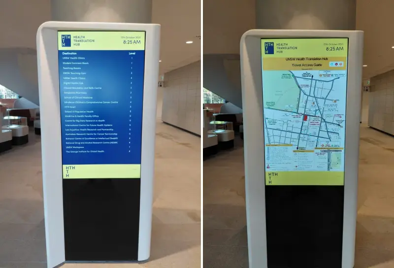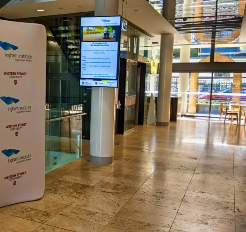
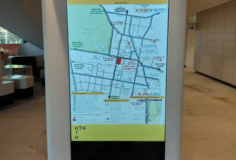
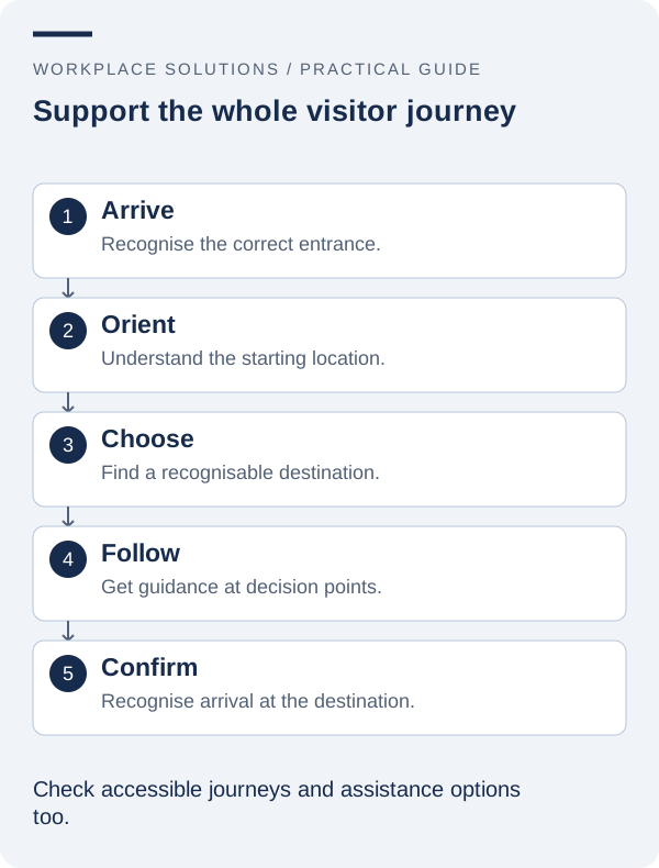
Finding a destination in an unfamiliar building involves more than reading a map. A visitor needs to recognise the correct entrance, understand the names used for places, choose a route and feel confident that they are still going the right way. Digital wayfinding can help with that sequence when it is designed around the whole journey.
A useful project therefore begins before a kiosk is selected. It examines the questions people ask, the decisions they face and the information available at each point. This guide outlines a practical approach for offices, campuses and other workplaces, with particular attention to accessibility, location data and ongoing maintenance.
1. Map real journeys through the building
Choose several common visitor tasks and walk through them from the beginning. Examples might include attending an appointment, finding a meeting room, locating an accessible entrance or collecting a visitor pass. Start where the visitor starts, which may be a car park, public transport stop or entrance mentioned in a confirmation email.
Record the points at which a person must make a decision. A large map at reception cannot resolve every question if the route includes an ambiguous lift lobby or an unlabelled corridor. The purpose of the exercise is to identify missing information, rather than assume that another screen is always the answer.
Include journeys that do not match the most direct walking route. A person using a mobility aid may need a different entrance or lift. Someone unfamiliar with local terminology may search for a service rather than a department name. Visitors arriving outside ordinary hours may encounter a different access arrangement.
Invite reception, facilities and accessibility representatives to contribute what they see in everyday use. Their observations can uncover recurring problems that are absent from a drawing. Keep the resulting journey map simple enough that everyone involved can explain the main decisions it identifies.
2. Make destination names recognisable
A technically correct destination name can still be difficult to find. Organisations often use abbreviations, legacy department names or internal room codes that mean little to a visitor. Start a destination list containing the public name, location, common alternatives and the department responsible for maintaining the entry.
Use the same public names in appointment information, directories, maps and physical signs wherever practical. If an invitation says “Training Centre” while the building directory says “Learning Services”, the visitor must make an unnecessary inference. A naming review can remove that confusion without changing the underlying technology.
Where a platform supports synonyms or alternative search terms, demonstrate the required examples during evaluation. Search behaviour is a product capability to confirm, not a universal feature. If the interface uses a fixed list instead, group destinations in a way that matches visitor expectations and avoids excessive scrolling.
Decide how temporary destinations, relocated teams and shared rooms will be named. A clear change process helps stop several versions of the same place appearing across the building. It also makes it easier for staff to give directions that agree with the digital information.
3. Place information at useful decision points
The right location for a wayfinding display is usually a place where people need to make a choice and can safely pause. Observe pedestrian flow, queues and door movement before finalising a position. A display should not create a new obstruction while trying to resolve an existing navigation problem.
Check the relationship between the map and the viewer. Labels such as “You are here” only help when the map’s orientation makes sense from the display position. Ask first-time users to explain their intended first move after viewing the map; hesitation may reveal a problem that is difficult for a designer familiar with the building to notice.
Think about what happens after a visitor leaves the display. They may need confirmation at the next junction, a recognisable landmark or clear physical identification at the destination. Digital wayfinding and conventional signage should support the same route rather than operate as separate projects.
For complex sites, start with a small number of high-value decision points. The pilot can show where additional guidance is actually needed. Installing displays at every available wall may add maintenance work without improving the visitor’s understanding of the space.
4. Include accessibility in the route and the interface
Accessibility has a physical part and an information part. A readable interface cannot make an unsuitable route accessible, and an appropriate route is of limited use if someone cannot find or operate the display. Review both with the relevant building and accessibility specialists.
For the interface, consider text size, contrast, plain language, touch targets and the amount of information shown at once. The W3C explanation of target size is a useful reference for digital controls, although a public kiosk also requires testing with its actual hardware and physical setting. A web checklist alone does not establish that an installation is accessible.
Do not express routes or destination categories using colour alone. Add words, symbols or other cues that remain understandable without distinguishing particular colours. Check whether language support is required and how translated place names will stay consistent with physical signs.
Provide a clear alternative for people who cannot use the interface or prefer human assistance. That might be a staffed reception point, a phone number or another approved information channel. Test those alternatives as part of the journey, rather than treating them as a footnote on the final screen.
5. Give location data an owner and a change process
Wayfinding information becomes unreliable when the building changes faster than its records. A room may be renamed, a department may move, or a lift may be temporarily unavailable. Establish who can authorise each type of update and where the approved version of location information is maintained.
A location register should distinguish permanent details from temporary conditions. Keep public destination names, levels and identifying information together. Document how a temporary closure is reported, reviewed, published and removed. Any route advice associated with a closure should be checked through the organisation’s facilities process.
If the proposed system imports data from another source, ask how updates are matched and how missing or invalid entries are handled. Stable identifiers are often useful when display names change. The exact approach depends on the integration, so use realistic sample data in the demonstration.
Make verification part of the update. After a change, someone should check the information on the relevant display and, where necessary, walk the affected route. Publishing successfully is not the same as confirming that a visitor can follow the new guidance.
6. Test with people who do not know the building
Internal teams quickly learn routes and stop noticing confusing details. Recruit people who are unfamiliar with the area for a small usability exercise, with appropriate permission and support. Give them a destination and observe what information they use, where they pause and when they ask for help.
Avoid coaching them toward the answer. The purpose is to understand the journey as it is presented. Ask participants to describe what a label means to them and what they expect to happen when they select an option. Record the point of confusion, rather than labelling the person as having made a mistake.
Use a mixture of ordinary and less direct tasks. Test similar room names, destinations on different levels, accessible route information and a destination that is not listed. The “not found” experience matters: people should have a clear next step instead of repeatedly trying the same search.
Fix a manageable set of issues and repeat the relevant tasks. This turns feedback into an improvement cycle. A short, well-observed pilot can be more valuable than a large satisfaction survey that does not reveal where a journey breaks down.
7. Plan for closures, interruptions and support
Define what the workplace will do when a display is unavailable or its information cannot be trusted. Make the responsible contact easy to identify, keep device and location records current, and agree on temporary assistance arrangements. An unavailable kiosk should not leave staff uncertain about who owns the problem.
Ask the supplier to explain the behaviour during network or data-source interruptions. A display might continue showing previously downloaded information, show a warning or stop providing some functions. Those possibilities have different consequences for navigation and need to be understood before launch.
Keep ordinary wayfinding separate from approved emergency arrangements. A visitor navigation system should not be assumed to replace required emergency signs, evacuation procedures or other life-safety provisions. Any relationship with those systems needs the appropriate professional review and a clearly defined scope.
Train reception and support staff to recognise an information problem as well as a technical fault. A screen can be switched on and responsive while still pointing people to an outdated location. Include that distinction in incident reporting so the issue reaches the right owner promptly.
8. Measure confidence and clarity, not just interactions
A large number of touches does not automatically indicate successful wayfinding. It may mean that visitors are exploring, or that they are struggling to find an answer. Combine any available usage information with observation, staff feedback and the outcomes of representative navigation tasks.
Useful questions include whether visitors choose the correct entrance, recognise destination names and reach the next decision point without uncertainty. If you record time or assistance requests, use a consistent method and acknowledge changes in building activity that could affect the comparison.
Review the destination register when facilities change and revisit journeys after a refurbishment or service move. The physical environment is part of the product experience. Keeping the display software current cannot compensate for an unreviewed change to the building around it.
Explore digital wayfinding alongside directory boards when preparing your brief. Explain the journeys you want to improve, the information sources you already maintain and the people who will own updates. Those details make the discussion with Workplace Solutions far more concrete than a request for a generic kiosk.