Digital signage becomes useful when someone takes responsibility for what it says. A screen filled with attractive but unrelated slides can still leave people unsure where to go or what to do. A content strategy gives each display a purpose, connects messages to their audience and establishes the process for keeping information current.
This guide focuses on the editorial work behind workplace screens. It applies to general announcements as well as content used alongside directories, room information and other digital displays. The objective is a manageable communication plan that helps people, rather than an obligation to fill every available moment with new material.
1. Start with the audience and the moment
Describe who is likely to see each display and what they are doing at that moment. A visitor entering reception may need immediate directions. An employee in a shared area may have time for a short operational update. An event attendee may be comparing times and locations while moving through a foyer.
These situations call for different messages and different levels of detail. Avoid assuming that a company-wide presentation is suitable for every screen. The same organisation can have several distinct communication needs within one building.
Identify the questions that the display can usefully answer. Ask reception staff, local managers and the people who use the space. Sort the questions into those requiring immediate guidance, those suited to a brief announcement and those better handled through another channel.
Assign a primary audience to each content item. If a message is intended only for staff, confirm that its display location is appropriate. If it is intended for visitors, remove internal terminology and context they cannot reasonably be expected to know. Clear audience decisions make later design choices easier.
2. Write one useful message at a time
A good screen message has a clear point and, where relevant, a next action. Begin with what the viewer needs to know rather than the history of the announcement. Keep the wording direct and avoid asking a passing reader to interpret a long paragraph.
For example, “Building services update” is less useful than “Level 3 meeting rooms: use the east lift today”, if that wording has been approved and accurately describes the situation. The second version identifies a place and an action. It also needs a clear expiry because its usefulness depends on time.
Separate the essential message from supporting detail. A short link, an approved contact point or another suitable channel can provide additional information. If using a QR code, explain its destination and offer an alternative where practical. The message should still make sense to someone who does not scan it.
Check the tone against the purpose. A welcome screen can be warm without becoming vague, while an operational notice can be direct without sounding abrupt. Use a consistent editorial style so that messages from different departments still feel like part of one dependable service.
3. Create a small, reusable set of content types
Define a few content types that match recurring needs. These might include welcome information, local directions, operational notices, event reminders and general workplace announcements. Give each type a template with a clear hierarchy and a known place for the next action or expiry.
Templates should make the correct approach easy without forcing every message into the same layout. A directory entry and a short notice have different information structures. Keep those differences visible while maintaining consistent typography, colours and language across the service.
Test templates with realistic content, including long names and ordinary variations in wording. If a design only works when a heading has three short words, publishers may either break the layout or remove information that viewers need. Set practical limits and provide examples that explain them.
Keep an approved fallback template ready. General arrival guidance or a reliable assistance point can be useful when no time-sensitive message is scheduled. Fallback content should have an owner and a review date too; calling it permanent does not make it immune to change.
4. Design for readability in the actual space
Use the viewing environment to guide the visual design. Check how far away people stand, how long they are likely to look and whether lighting or reflections affect the screen. A layout that is comfortable on the publisher’s laptop may be difficult to understand from across a lobby.
Prioritise clear headings, strong contrast and enough space between information groups. The W3C contrast guidance is a useful reference for digital text, alongside practical assessment of the installed display. Avoid using colour alone to communicate status or urgency.
Use images that explain the message. A location photograph, a recognisable facility image or a simple diagram can support understanding. Decorative imagery should not compete with a short instruction or introduce an impression that is inconsistent with the actual workplace.
Review motion and the pace of changing content carefully. Viewers need enough time to understand the message, and some content does not benefit from animation. Test with representative users rather than selecting a universal slide duration without considering the amount of information and the setting.
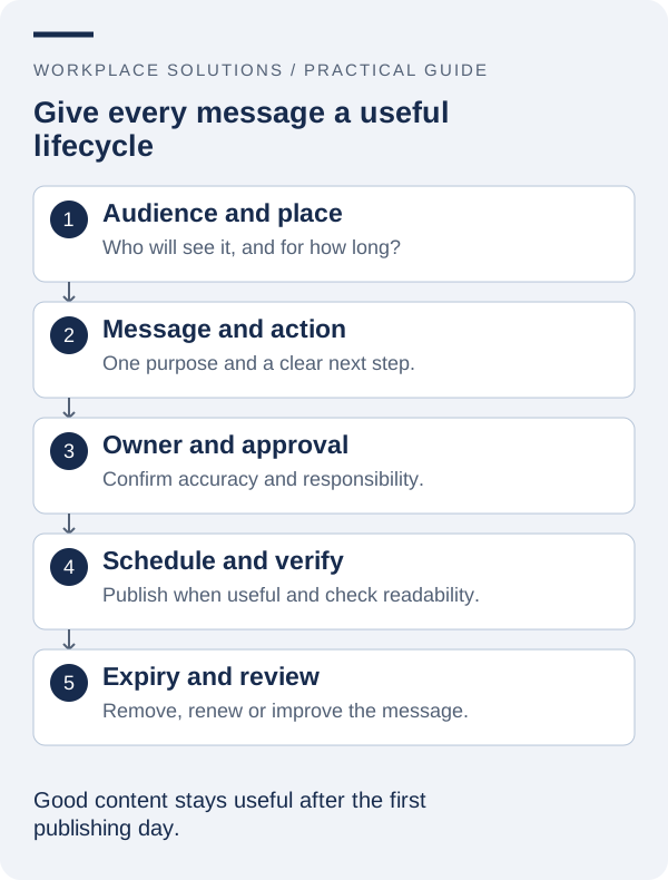
5. Plan publication, priority and expiry
Create a content calendar that records when messages become relevant and when they should stop appearing. Include the owner, audience, location and approval status. This makes it easier to see conflicts before several departments expect their messages to dominate the same screen.
Agree on how priorities are handled. A time-sensitive local instruction may need to take precedence over a general announcement, while a promotional item should not displace essential navigation information. The rule should be based on the display’s purpose rather than the seniority of the person requesting the slide.
| Content type | Useful planning question | Review trigger |
|---|---|---|
| Welcome information | What should a new visitor do first? | Reception or access process changes |
| Temporary directions | Which location and action must be clear? | The temporary arrangement ends |
| Event reminder | Are the time and destination confirmed? | The event changes or finishes |
| General announcement | Why is this useful to this audience? | The owner’s scheduled review date |
Where scheduling or automatic expiry is required, confirm the software’s behaviour with the supplier. A calendar in a planning document does not itself remove content from a screen. Make the final publication and removal responsibilities explicit.
6. Establish a practical editorial workflow
Define who requests a message, who edits it, who approves it and who publishes it. Some organisations can combine several roles; others need a more formal separation. The process should reflect the information being shown and the consequences of getting it wrong.
Give requesters a short brief rather than asking them to design finished slides. Useful fields include the audience, key message, desired action, location, supporting source, publication period and owner. This helps the publishing team focus on communication instead of trying to infer the purpose from a crowded document.
Set a route for corrections and urgent removals. A content owner should know how to report an incorrect date or instruction and who can act when the usual publisher is unavailable. Keep the process proportionate while ensuring that it does not depend on one person’s memory.
Review permissions as responsibilities change. Access to a publishing tool should follow the organisation’s approved account process. If the platform offers roles or approval controls, assess how they support the workflow; if not, document how the team will manage review and accountability.
7. Coordinate screens with other workplace information
Digital signage is one part of a wider communication environment. Visitors may already have received an email, staff may use an internal channel and the building may contain physical signs. Check that names, locations and instructions agree across those touchpoints.
Use the screen for information that suits the moment of viewing. A short reminder may reinforce a detailed staff message, but it should not become the only place where someone can obtain essential instructions. Consider the needs of people who are away from the site or who cannot easily read the display.
For directory and room information, keep the agreed source of truth clear. Re-entering the same data manually into several templates creates additional opportunities for inconsistency. Where an integration is proposed, confirm its scope and ownership rather than assuming that all channels will remain synchronised automatically.
Coordinate significant changes before publishing. A renamed room, relocated service or revised arrival process may require updates in several places. A small shared change checklist can prevent the display from becoming the only channel using the new wording while everything else still points to the old arrangement.
8. Review what helps and remove what does not
Evaluate content against its intended purpose. Ask whether viewers understand the message and know the next step, whether repeated questions have changed, and whether publishers can maintain information accurately. The number of slides produced is not a reliable measure of communication quality.
Collect feedback through simple, appropriate methods. Reception observations, brief user checks and a periodic content review can reveal confusing wording or unnecessary material. If comparing results over time, consider other changes in the workplace that may affect what you observe.
Remove content that no longer serves a clear need. A smaller set of accurate, relevant messages can be more useful than a constantly expanding rotation. Keep successful examples as part of the editorial guidance so that new publishers can learn from the work already done.
To develop a content plan alongside your display technology, explore digital signage and Workplace Solutions’ consulting and support services. Bring examples of current messages and the audiences you want to reach to the discussion, so the solution can address both the screen and the information it carries.